| [checked revision] | [checked revision] |
No edit summary |
|||
| Line 3: | Line 3: | ||
== Modules used == | == Modules used == | ||
[[Module:Utils]] | |||
[[Module:Icon]] | |||
[[Module:IconUtils]] | [[Module:IconUtils]] | ||
Revision as of 18:13, 7 December 2024
Description
Use to create tiny icons (and captions). By default, the icon size is 28px but it can be re-defined.
Modules used
Module:Utils Module:Icon Module:IconUtils
Syntax
{{Icon|name|style|link|size|border}}
| Field | Accepted Parameters | Example | Notes |
|---|---|---|---|
name
|
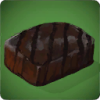
item name | Charred Meat | Name of the item as in the game |
style
|
1,2,3 | 1 | Defines the (caption) style. Default is a small icon that is unlinkable with no caption.
|
link
|
Page Name or 1 | Charred Meat | Optional. Use if you want the icon to also link to a page.
|
size
|
any px size | 50 | If you are using this, you must write out size= and assumes px.
|
border
|
color name or Hex code | green | If you are using this, you must write html color name or Hex code as border=.
|
Samples
| Example | Syntax | Result |
|---|---|---|
| Style 1, Size 100px, no link | {{Icon|name=Charred Meat|size=100}}
|
|
| Style 1, Size 50, Link itself | {{Icon|name=Charred Meat|link=1|size=50}}
|
|
| Style 2, No Size, Link to page Food | {{Icon|name=Charred Meat|link=Food|style=2}}
|
 Food Food
|
| Style 3, Size 100, Link itself | {{Icon|name=Charred Meat|link=1|size=100|style=3}}
|
Charred Meat |
| Style 4, Size 50, Link itself, with border | {{Icon|name=Charred Meat|link=1|size=50|style=4}}
|
